Social networks are a common platform that accumulates enormous volume, variety and veracity of data. Recent researches show that data produced by these networks have reached an unbelievable magnitude. For example, Facebook generates 4 Petabytes of data every day, i.e approximately million of gigabytes. Thus, obtaining meaningful insights from such a large volume and variety of data sources represents both a challenge and an opportunity. Is well known that people using social media are constantly seeking to gain information from the crowd as an additional source to traditional media. All of this reveals different behavioural patterns of human activity.
However, having aforementioned data available, but no structure to serve a particular purpose becomes very useless. Therefore, adequate and ethical data aggregation and analysis can help in providing predictions toward the future trends and focus of the consumers, prosumers and application providers. The best way to overcome these issues is by including a smart data visualization tool and supporting technology that will break the data variety and volume into intelligent smaller and meaningful pieces.
The importance of a data visualization tool
Data visualization by definition is a graphical representation of data and information. There are many visual elements like charts, graphs, maps and others incorporated within the visualization tool, offering an accessible approach for noticing and understanding trends, outliers, and patterns in the present data. Simply said, data visualization tools and technology are essential to analyse massive amounts of information and make data-driven decisions.
In line with the business aids, the visualization tool that can be seen as a sort of a “business intelligence”, helps in the process of parsing large amounts of data and then presents that data in new ways to facilitate understanding, decision making and getting the most insights out from the data. The main point of such representation is the fast information transfer from the machine to the human brain in an efficient and the most meaningful manner possible. Therefore, the visualization not only brings aesthetic value, but it also counts the clarity of the message that it conveys.
The existence of such entities that handles all those data issues and provides meaningful visualization insights is an important aim. Next section mentions some of the popular ones.
Popular market visualization and analytics tools
Currently, there are a lot of companies and platforms worldwide that offer various analytic and visualization services or concepts that propose to provide value to the business sector. Among them, the more prominent are shortlisted in continuation:
Cyfe a cloud-based online business visualization dashboard created in 2012 supporting real-time business analytics software and responsive customer service. Cyfe users can share dashboard data with managers, clients, employees, or other collaborators. From social media, marketing and sales aspects, Cyfe helps users to monitor and analyse data scattered across multiple online channels.
GoodData is specifically useful for companies seeking to gain insights into marketing, sales and customer service performance. GoodData is a cloud-based business intelligence platform that specialises in helping marketers understand their customer behaviour and needs. Their interactive dashboards use visualisation tools and self-service discovery to help decision-makers understand marketing’s overall impact on the business, and to gather tactical insights for specific campaigns and programs.
Tableau is a software company providing solutions that effectively allow people to see and understand data. The company’s goal is to make big data accessible to ordinary people. The company caters to both individuals and businesses. It allows intuitive analysis and understanding of big data allowing users to create interactive dashboards and drag-and-drop features to develop data visualisations.
Grow.com gives marketers access to powerful visualization dashboards and business intelligence reporting with real-time data. Grow.com automatically pulls data into dashboards for the most up-to-the-minute reporting. Customised branded reports allow agencies to build client-specific reports and collect data from across campaigns. The platform makes data analytics accessible across a company.
Marketo cloud-based platform that allows marketers to create, automate and track their advertising campaigns. The software helps companies of all sizes generate more revenue with less manual effort. Marketo provides a multi-channel campaign management, inbound and search marketing solutions, event marketing integration, lead management software, customer analysis, landing page tools, behaviour tracking, CRM integration and engagement marketing.
Sisense a business intelligence software that provides analytics and market insights for small to enterprise-level businesses. Sisense has business intelligence software that lets non-technologically inclined users combine multiple data sets, customise dashboards, generate data visualisations, and share them with other users. This web-based solution unifies data into one centralised location without the use of hardware or IT departments.
All mentioned market propositions offer their own value uniqueness. Some of them target big companies, the other focuses on small businesses, marketing, advertising, sales, campaign and etc. But, their common point for providing successful visualisation services to assist and direct the work of the “customer” is the access to their data, no matter whether they are private or public. Usually, these companies are centralized entities and there is no guarantee approach that the data will stay private and save. Therefore, introducing data decentralization and security is a challenge that is not achieved yet. ARTICONF [2] as a novelty project promises such success. Hence, within the ARTICONF platform is incorporated the tool for visualization and data analysis, known as TAC (Tools for Analytics and Cognition). Meaning, TAC supports all features of the market competitors and, simultaneously, reuses all benefits offered by the platform in background. Below, in detail are explained the advantages and the functions of this tool.
Innovative Tools for Analytics and Cognition (TAC)
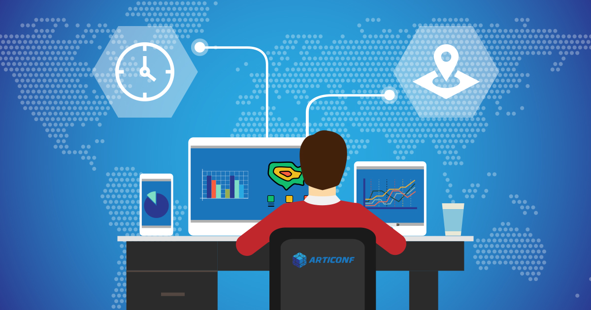
Tools for Analytics and Cognition (TAC) is a crucial tool-set, part of an ARTICONF’s [2] decentralized social media ecosystem, which enhances business productivity by tracking updated data triggers from diverse social media events. The TAC is seamlessly coupled with other ARTICONF tools [2] and provisions socially-contextual geospatial and temporal data aggregation microservices to gain intelligent visual insights. To better understand the proposed tools, we illustrate some of its experiments through a car-sharing use case, provided by an SME Agilia Center SL. TAC takes car-sharing use-case activity traces that have output data according to the metrics’ output data microservices (including geospatial, temporal and monetizing) [3]. Geospatial data contributes to the car-sharing use-case, by providing and suggesting effective ways to relieve the problems of traffic jams, parking difficulties, and air pollution. On the other side, car-sharing temporal data makes it possible to statistically model the users’ demand in terms of drop-off and pickup rates, and the parking times of vehicles to understand the current panorama of the demand for transport in the wanted location [4].
The visualization tool is designed to work in conjunction with Geospatial/Temporal data to make huge and complex pipeline streams more quickly and easily understandable through graphic representation [5]. The data analytics provide mathematical transformations on data as well as enhanced aggregation. An interesting analysis during the research was to observe with the distance metric aggregation of average, minimum, maximum and medium price for km for car-sharing use-case, as shown in Figure 1. Another visual representation is the pie chart, which is a bucket aggregation of a car brand that is most used by the users, and also what type of car of a certain brand was the favorite one amongst the users, as shown on Figure 2.
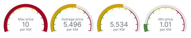
Figure 1: Data visualization for the metric aggregation for distance (km).
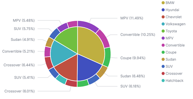
Figure 2: Data visualization for the bucket aggregation for car brands.
Geospatial maps visualization shows the starting positions of travels that made the most revenue. This visualization required metric aggregations on the data field containing geographical information (latitude and longitude) about the travel starting positions and counted the total spending based on the starting positions of the travel, visible in Figure 3.
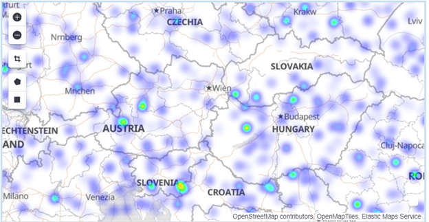
Figure 3: Map visualization for the geographical points with most revenue.
Having a clear picture of who are the popular market visualisation tools and TAC as a new promising competitive tool, in continuation is given comparison among the most prominent and relevant characteristics of these competitors.
TAC advantages over other visualization tools
The visualization-based communication is competitive with respect to several features: real-time data updates, historical data archiving, smart guided analytics, interactive monitoring interface, social media actor integration, return of investment (ROI) and return of collaboration (ROC). Real-time updates are important because it allows users to make more pertinent and informed decisions, and to then take action (at the right time) based on that data. Accessing the archives of the right data can not only save the business money but also add value to the business. Guided analytics is a sub-field at the interface of visual analytics and predictive analytics focused on the development of interactive visual interfaces for business intelligence applications. Social media actor integration finds efficient ways, and opportunities to leverage powerful platforms. Return of investment refers to the proceeds obtained from the sale of the investment of interest. Social collaboration refers to processes that help multiple people or groups interact and share information to achieve common goals. Return of collaboration improves the product-development process or take time out of the sales cycle.
Comparing the above-mentioned tools and proposed TAC, it can be seen that all competitors offer an interactive monitoring interface, but some of them do not have features that are offered by TAC. That’s why TAC is a superior tool that can be used not only for ARTICONF but further. For example, Cyfe, Grow.com and Marketo do not have smart guided analytics, while GoodData, Tableau and Marketo do not allow real-time data updates. Besides, Marketo and Grow.com do not offer social media actor integration. Out of seven features that we compared here, our competitors cover at most four of them, while TAC covers all seven. Historical data archiving is offered only by TAC, Cyfe and Marketo, while ROC driven analytics is covered only by TAC. GoodData and Marketo support programs for the revenue part (ROI), however not for the collaboration (ROC). The table shows the TAC advantages:
| Competitor | Real-time data updates | Historical data archiving | Smart guided analytics | Interactive monitoring interface | Social media actor integration | ROI driven analytics | ROC driven analytics |
| Cyfe | ✔ | ✔ | – | ✔ | ✔ | – | – |
| GoodData | – | – | ✔ | ✔ | ✔ | ✔ | – |
| Sisense | ✔ | – | ✔ | ✔ | ✔ | – | – |
| Tableau | – | – | ✔ | ✔ | ✔ | – | – |
| Grow.com | ✔ | – | – | ✔ | – | – | – |
| Marketo | – | ✔ | – | ✔ | – | ✔ | – |
| TAC | ✔ | ✔ | ✔ | ✔ | ✔ | ✔ | ✔ |
Having in mind that data visualization is a very important part of the TAC tool, we can say that with that the tool is very suitable for business. Business actors will know how to plan and organize their project in order to gain more profit, more users and more collaborations. This enables social networks and in fact businesses carried out over social networks to be of larger value with enhanced, but complete vision. TAC tool is needed for completing the idea of the Internet of Things, an idea that ARTICONF uses as one of its goals. Today the social network is part of our everyday life, ARTICONF comes as a correction, making the social network world a more insightful place to be.
References:
[1] W. Kenton. “Social Networking”, Investopedia blog, published Jul 28, 2020, source https://www.investopedia.com/terms/s/social-networking.asp
[2] R. Prodan et al., “ARTICONF: Towards a Smart Social Media Ecosystem in a Blockchain Federated Environment,” in Euro-Par 2019: Parallel Processing Workshops, vol. 11997, U. Schwardmann, C. Boehme, D. B. Heras, V. Cardellini, E. Jeannot, A. Salis, C. Schifanella, R. R. Manumachu, D. Schwamborn, L. Ricci, O. Sangyoon, T. Gruber, L. Antonelli, and S. L. Scott, Eds. Cham: Springer International Publishing, 2020, pp. 417–428.
[3] A. Karadimce, N. Paunkoska (Dimoska), D. Bogatinoska, Capeska, N. Marina, and A. Nandal, “Guided Analytics Software for Smart Aggregation, Cognition, and Interactive Visualisation,” in International Conference on Innovations in Computational Intelligence and Computer Vision (ICICV-2020), Jaipur, Rajasthan (INDIA), January 17-19, 2020.
[4] C. Boldrini, R. Bruno, and M. Conti, “Characterising demand and usage patterns in a large station-based car sharing system,” in 2016 IEEE Conference on Computer Communications Workshops (INFOCOM WKSHPS), Apr. 2016, pp. 572–577, doi: 10.1109/INFCOMW.2016.7562141.
[5] A. Karadimce, D. Capeska Bogatinoska, M. Sefidanoski, N. Paunkoska (Dimoska) and N. Marina “Tools for Analytics and Cognition Framework for a Car-Sharing Use Case”, in 43rd International Convention on Information and Communication Technology, Electronics and Microelectronics (MIPRO 2020), Croatia, September 28 – October 2, 2020.
This blog post was written by University of Information Science and Technology “St. Paul the Apostle” – Ohrid team in September 2020.
< Thanks for reading. We are curious to hear from you. Get in touch with us and let us know what you think. >